
AI governance · 2024 to 2025
Designing AI Assisted Compliance
A human-in-the-loop approach to safer, more consistent decisions.
01 · Background
Risks and controls
OneTrust is a B2B platform for privacy, security and AI governance used by over 14,000 organizations, half the Fortune 500 among them. Compliance teams use it to identify risks and apply controls that reduce them. This project was about the second half of that sentence.
A risk is a threat you have written down: our AI model produces biased or harmful outputs. A control is the safeguard that reduces it: bias testing before deployment, human review of outputs, monitoring for drift.
02 · The problem
Control selection had no system-level guidance
A risk team opened the controls library, saw hundreds of options, and had to know what to pick. The system offered nothing. As organizations scale, that produces gaps in coverage and decisions nobody can reconstruct later.
-
Highly manual
Search, read, guess, repeat. No guidance on what to pick for a given risk.
-
Dependent on expertise
Senior people had strong instincts. Newer people under-mapped or spent a long time searching.
-
Inconsistent across teams
Two teams, the same risk, different answers. A serious problem when an auditor asks why.
03 · Research
The reasoning mattered as much as the recommendation
I ran ten user interviews with the PM, alongside usage data on how often people opened the library, how long they spent searching, and where they ended up with gaps. The quantitative signal matched what we were hearing.
3×
More trust with rationale visible
Users trusted recommendations three times more when the rationale was visible.
Compliance officers have to explain decisions to auditors. A tool that can’t help them say why doesn’t get used. That finding set how every explanation in the feature works.
04 · Decision
Banner, or inside the modal
The obvious move was to put recommendations inside the modal people already used. I went the other way.
I took the extra click. Keeping the AI path scannable and the manual path untouched was worth more than saving it.
05 · The design
Evaluating AI recommended controls
Everything needed to decide, in one place: the control, the confidence, and why it was surfaced.
-
Rationale
Explains why a control is recommended, so the user can validate whether it applies to their situation. Inline, one click away, never a tooltip. It has to survive being pasted into an audit response.
-
Confidence
A four-step scale, not a percentage. The model team wanted a number. Research said a number created false precision and raised anxiety.
-
Selection
Explicit select or dismiss, nothing auto-applied. The review step is not friction. It is what lets a compliance officer own the outcome.
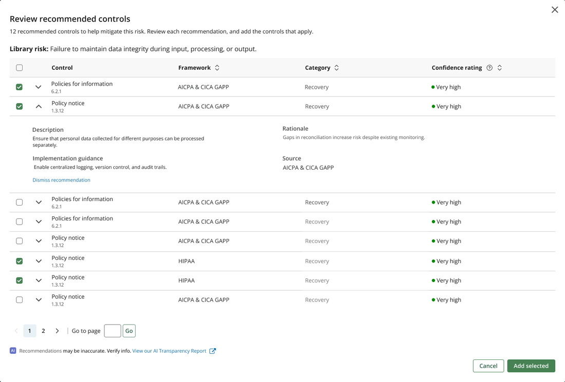
Try it · the review step, rebuilt in HTML
Review recommended controls
12 recommended controls to help mitigate this risk. Review each recommendation, and add the controls that apply.
Library risk: Failure to maintain data integrity during input, processing, or output.
Description
Ensure that personal data collected for different purposes can be processed separately.
Implementation guidance
Enable centralized logging, version control, and audit trails.
Rationale
Gaps in reconciliation increase risk despite existing monitoring.
Source
AICPA & CICA GAPP
Dismiss recommendation
Description
Ensure that personal data collected for different purposes can be processed separately.
Implementation guidance
Enable centralized logging, version control, and audit trails.
Rationale
Gaps in reconciliation increase risk despite existing monitoring.
Source
AICPA & CICA GAPP
Dismiss recommendation
Recommendations may be inaccurate. Verify info. 5 of 12 shown
06 · Measurement
Defined before shipping, not after
Three dimensions, agreed with product and engineering before V1 shipped, so there would be a baseline.
Decision quality
Reduced reliance on individual expertise.
- Recommendation acceptance rate
- Coverage completeness across risks
- Variance in selection across teams
User confidence
Rationale and confidence actually support the decision.
- Confidence engagement rate
- Reviewed vs. skipped recommendations
- Qualitative feedback on trust and clarity
Workflow efficiency
Less time lost in a library of hundreds.
- Time to map controls per risk
- Manual searches per session
- Drop-off in the selection flow
V1 shipped to private preview with 10 customers. I was laid off in a company-wide reduction before post-launch data came in, so there are no outcome numbers here. The framework and the pre-launch research are what I have.
07 · Tradeoffs
Three tradeoffs
Trust vs. automation
Traded: kept humans in the loop. Users review rather than auto-apply, which costs speed.
Next: auto-apply for very high confidence recommendations, with guardrails.
Entry point vs. discoverability
Traded: a banner is easy to ignore. Some users missed it entirely.
Next: smarter triggers. Surface it when someone is mid-task on a risk with gaps.
Signal quality
Traded: shipped V1 with limited validation of the confidence scoring.
Next: align with the model team on what high confidence actually means.
08 · Reflections
A recommendation users don’t understand is a recommendation they won’t follow.
-
01
Rationale and confidence are not nice to have. They are how a person calibrates trust in a system.
-
02
Lightweight entry points reduce friction, but they need deliberate discoverability or they disappear.
-
03
Humans in the loop build confidence and cost speed. The workflow decides which one matters more.
Next case study